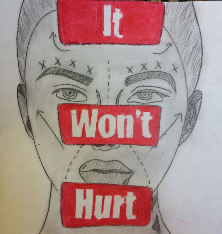
Title: It Won't Hurt
|
Exhibition I created this piece because I wanted to show a message. To show something that is happening everyday, because people feel the need to "perfect" themselves. I wanted to experiment with the use of charcoal and pastels, because I have never used these things as a medium not only together, but not seperately either.
|
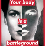
"Your Body is a Battleground" By Barbara Kreuger
Inspiration I am very inspired by Barbara Kreuger and the styles and techniques that she uses to put across her powerful messages. During my research, I came across the image that is above. I saw it and it really got me thinking, and the statement is something that really got to me. It made me stop and think about things. This empowering message, set across by a simple image and a few words. I knew that this was something that I wanted to do. I wanted to create an image based off of something that is a big occurance in our world today, and set an example to show people the background of our beauty standards.
Research In my research, I had to look into plastic surgery, and see the most common things that were to get done. I wanted to really focus on the face, because I thought that it would be something that would give the most impact to a viewer that is looking at this piece of work.
I also had to look into the markings that are commonly put onto the patients to mark where each of the incisions are supposed to be. I feel like in my piece I was able to create and correctly represent these aspects. |
Process First Slide: This slide shows the sketch that I made. I used a picture that I had found off the internet of a model, and drew it on my own on regular computer paper. I sketched in pencil so my lines would be thin, and if any mistakes were made then they could be corrected.
Second Slide: This slide shows the sketch that I had created, traced in sharpie to make each of the lines more defined. My first intention for thi piece was to create it on canvas with acrylics, but I wanted to try something different. Third Slide: This slide is the slide that shows my project when it is all complete, before I decide to go on photoshop and edit out as many of the smudges as I could. I wanted to show a clean background, and not make it look like it was sloppy, and unorganized. Fourth Slide: This shows the edges of the smudges around the background that needed to be edited out in order for me to have such a clean picture. Fifth Slide: This is a close up of me using the eraser tool to make my background for my piece a clean and solid white. |
Reflection Overall, I think that this project was failrly well. It is not something that I am too proud of, but it is something that I can learn from and use to further my work and create things that are even better.
During this project, I did encounter a few struggles. One being the use of charcoal, and also the use of pastel. I noticed that the charcoal would either smudge too much, or not enough to gve the look that I wanted it to. Same things goes with the pastel. Only difference with that being, that the pastel owuld have those leftover crumbles, and they would sometimes scatter across the paper, creating the red to go in places it shouldn't have been. Connection to the ACT 1. My inspiration comes from the use of Kreuger's words within her pieces to create empowering messages, through a simple few words.
2. Kreuger uses the simple wpords she has in her pieces to portray tihngs as important messages in order to boost encouragement. This is exactly what I wanted to do for my piece. 3. From my research of kreuger I was able to look more into her pieces and really find out what they are trying to portray. 4. My central idea for this project was to create something that is happening in the real world. and show the effects that it has on both women and men, and how unecessary. 5. In conclusion, I was able to create something that I believe would be an image that portrays the truth in what women and men together go through while trying to perfect themselves. |
