|
Title: City as One
Size: 60.96 cm x 91.44 cm Medium: Photoshop November 16,2015 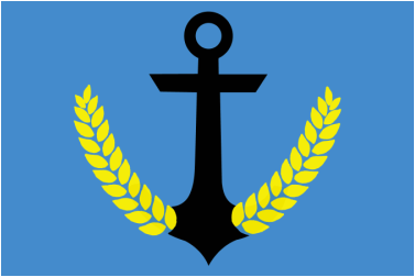
|
Exhibition: Why did I create the piece of work that I did? I created this because I feel like it represents Milwaukee, us as a city, at its best. I believe that my design is very clean and simple, and I am very happy with the outcome. I chose to use an anchor for the main focus, because I wanted to represent our ports. They're very important for us to trade things back and forth, and is also a great resource for transportation. I used the barley to represent our brewery industry, because we all know how much people in Milwaukee love their beer. But the overall meaning is something that represents us as a whole. It shows how we have settled down and found ourselves. It also shows how we continue to grow as a city, and continue to expand into bigger and better things.
|

"The American Dream" by Robert Indiana
Inspiration For the inspiration of my piece, I used The American Dream by Robert Indiana. Why did I choose to use this particular art piece? I chose to use this piece because Indiana likes to represent things through using symbols. Throughout this piece there are multiple symbols that all have an important meaning and things they connect with.
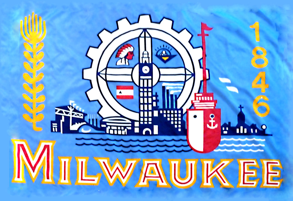
Current flag for the city of Milwaukee
I also took inspiration for the flag design that is already out for Milwaukee. I looked at all the colors and found my own meaning behind them, and used the ones that I felt mostly represented us. I also took inspiration from the main focus of this design to be industry, and how Milwaukee is as a whole.
|
Planning/Sketches First Slide: This slide shows the few pictures and notes that I took about my experimenting sketches.
Second Slide: This slide shows my first initial sketch/idea for my final piece of work. I knew I wanted to keep the idea of the anchor for sure, and somehow I wanted to show industry, so I chose the gear. I didn't go with this idea because I thought that it was a little too plain, and didn't exactly give off much of a meaning. Third Slide: This slide shows basically my final sketch before I began to create my piece on photo shop. I found a way to incorporate the industry through the barley, and get through the meaning that I wanted to represent. I also think that this choice is the cleanest of the few that I had, and would be best to do. |
Creation Process First Slide: The first slide shows how when opening photo shop, I decided to do my background color right away.
Second Slide: This slide shows how I have taken a picture of an anchor, but I erased the ends coming off of it. Third Slide: This slide shows the point where I have drawn and inserted the barley to the end of the anchor. Fourth Slide: So I didn't have to re-do the entire process from the previous slide, I duplicated the layer of the first barley I had completed. This made me know for sure both sides were the same. Fifth Slide: This slide shows the layer of barley I have created. Sixth Slide: I flipped the layer vertically by transforming it, and I moved it into place to be symmetrical with the other half. Seventh Slide: This shows how I used the bandage tool to clean around the edges of my piece the best that I could, so it would be neat and not all over the place. |
