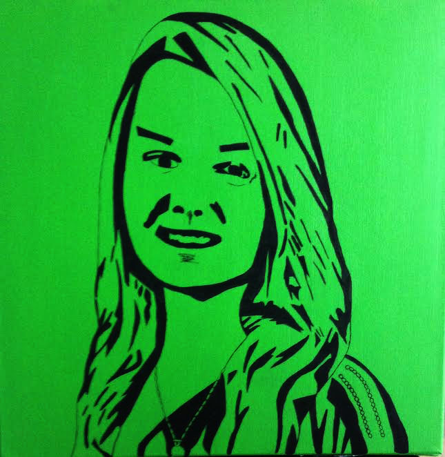
Title: Oneself
|
Exhibition I created this piece the way that I did because I wanted to have the connection to an inspiration to be obvious, but to also have my own style and likings incorporated into it. I chose the artists of Andy Warhol and William Kentridge because I feel like they go together pretty well, and their styles are very similar, but also have many differences. I used the color scheme that I did with the bold lines to make myself stand out, and to make myself known.
|
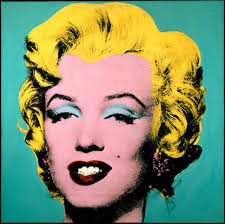
"Marilyn Monroe" by Andy Warhol
Inspiration/ Research I took inspiration from this piece because I really enjoy the color choices that Warhol chooses to use in his pieces. The bright colors with the black seem to really stand out to me.
I also chose to do this piece because I wanted my portrait to be an obvious connection, to an artist who's work catches my eye. I decided to use the same sort of style but put my own sort of twist into it. I wanted this piece to be recognizable to the connection of Warhol, but I also wanted to add the styles of another artist onto it, to make my piece to have more sense and style connected to it. While doing research to find the oerfect artist, I came across William Kentridge. I have never seen or heard of his works before, so I began researching to find something that I wanted to create my piece to be like. That is when I found the work below. 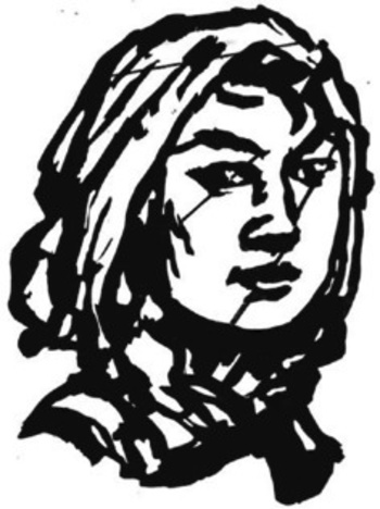
"Woman With Headscarf" by William Kentridge
When I came across this piece I knew that this was the sort of style that I was looking for. I knew that I wanted to stay with the bold black lines throughout my entire piece. I chose to do this idea because I wanted my piece as a whole to stand out, and have one's eyes move around the piece instead of being on one part of the canvas itself.
|
ProcessFirst Slide: This slide shows the initial sketch that I had made. It was originally part of a progression piece I made, but felt like it would make a nice project on its own.
Second Slide: This slide shows the transparency that I had printed to be able to project it easily onto my canvas. Third Slide: This slide shows my canvas before I coated it with my background color. Fourth Slide: This slide shows my experimentation of the choosing of the background color. I originally wanted to do a shade of blue, but the shade I was trying to achieve just wasn't coming out right. Fifth-Seventh Slide: These slides show the final color that I decided to use for my background. I first mixed it onto a tray then when I knew how much paint I needed and how much of both yellow and green I needed, I transported it into a closed container so I would have it for further purposes after the initial coat. Eighth Slide: This is the outline that I had for my piece before I began painting. Ninth Slide: This shows what my piece looked like after majority of it was completed. Tenth Slide: This slide is what a close up of my piece looked like before I went over the lines once again with black paint to ensure that they were solid/bold. |
Reflection Overall I believe that this project went very well. I knew that I wanted to do another self portrait, ever since a little after I had completed the previous one. I wanted to use this opportunity to show that my skills as an artist have grown, and that I am continuing to learn new techniques to better my work.
However, there were some struggles that I had come across. Things such as mixing the background color, and finding and finally agreeing on a color to use. I didn't want the color to be anything tacky, but I also wanted it to be something different. Which after a few tries, I have achieved. Connecting to the ACT 1. I feel like my inspirations for this piece tie my work together to make it something that represents myself. I used their techniques of both bold black lines, (Kentridge), and also incorporated the aspect of a bright color scheme (Warhol).
2. Both Warhol and Kentridge use the techniques of lines and color within their works. to make their pieces stand out and make a statement for themselves. 3. From my research, I have been able to discover artists that have similar styles within their works, and that the movement of Pop Art is something that is used to draw attention to whatever is being depicted. It draws the viewer in to see what is going on, and allows them to find their own connection to the work if it is not obvious. 4. My central idea for this project was to do something that would stand out and to kind of put myself out there to the world. 5. In conclusion to my researched, I found out that Warhol specifically likes to depict and use colors in his work that not everyone tends to use so much due to their intensity, and I decided to use that style in my piece. |
